The Brief
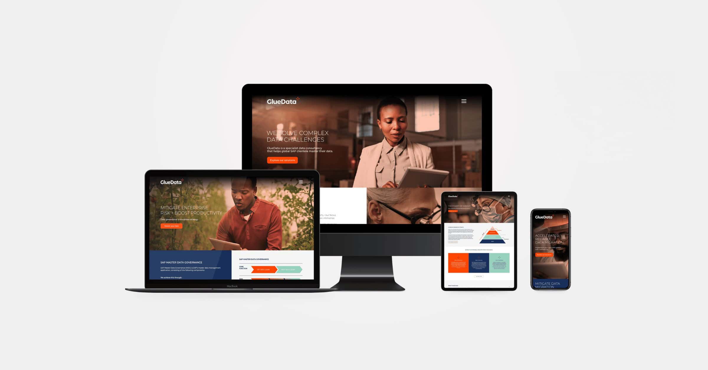
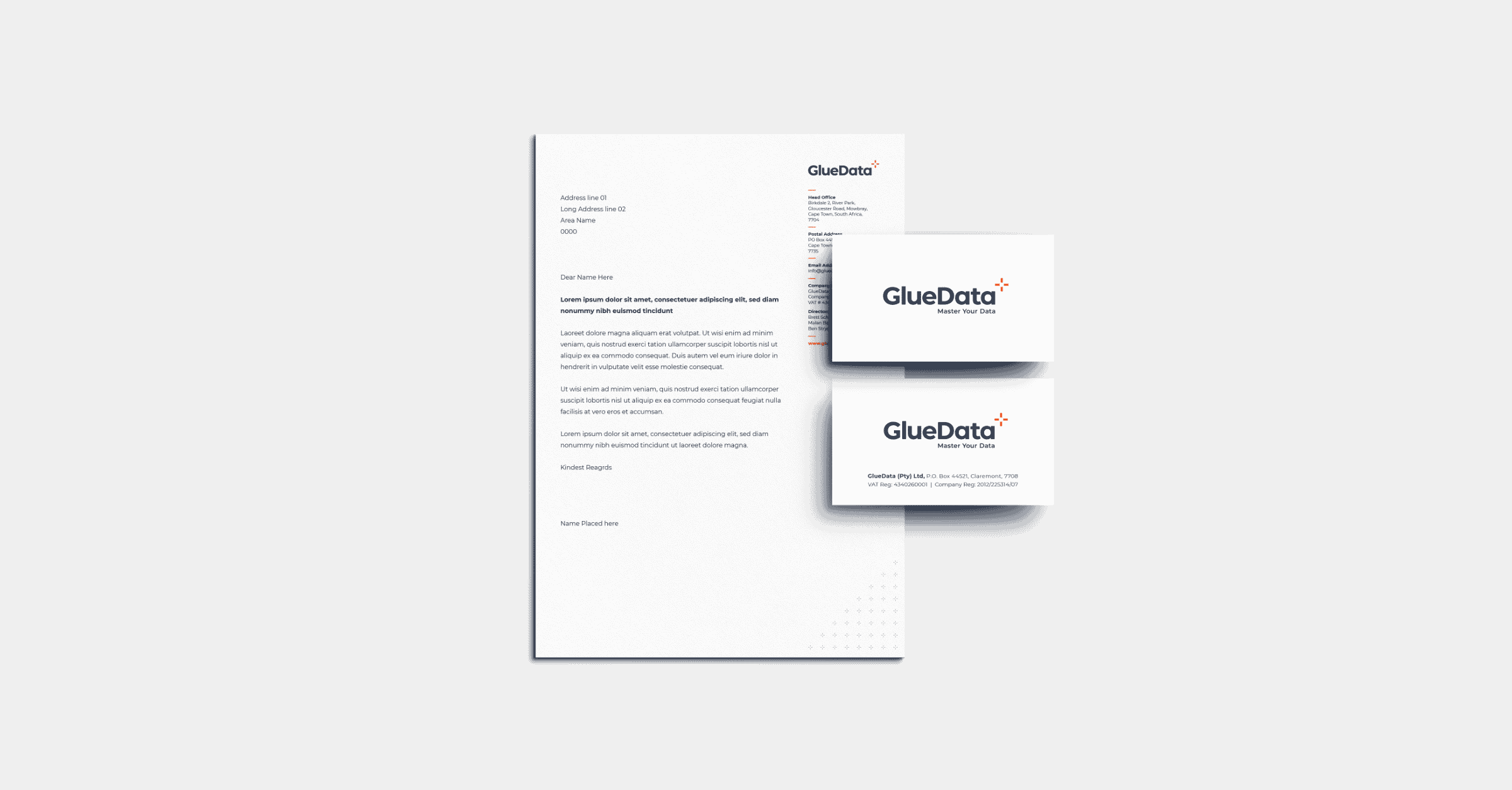
GlueData is a specialist SAP data consultancy that recently celebrated their 10-year business anniversary. The company has entered the UK and European markets and its core management team felt it was time to refresh both the brand messaging and identity. Branduo was tasked with the brand strategy, identity and website design for GlueData as well as communications and collateral design for their core product, SimpleData Management.
Deliverables
- Brand Strategy
- Brand Identity Design
- Copywriting
- PowerPoint Presentation Design
- Marketing Collateral Design
- Website design and development
Creative Partners
- Tim Harris Design
- DMN Creative
The Creative Challenge
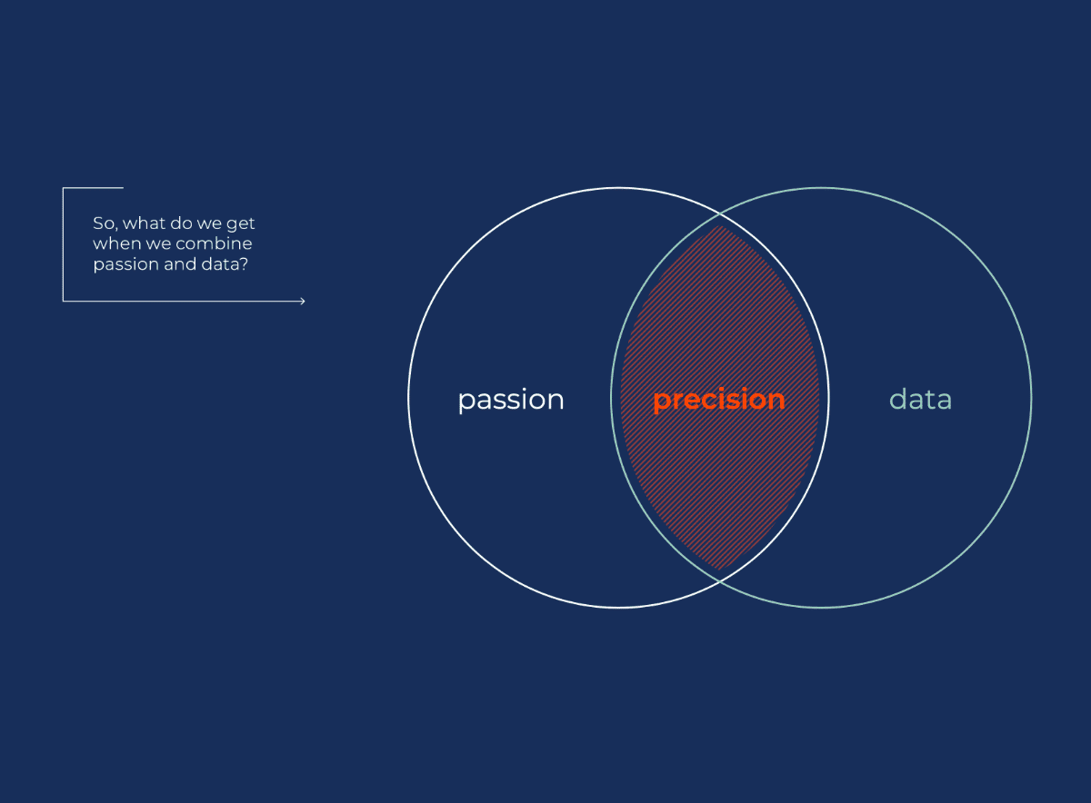
GlueData comprises a team of data specialists who speak like data specialists. Technical language and organograms are their natural communication style, which made for a very static and staid former brand expression. Beneath the technical astuteness however, lies real and raw passion for their work and its business outcomes. During our brand strategy workshop, I experienced the collision of data and passion that is GlueData, a genuinely unique and highly specialist business, that just needed some help speaking human.


The Strategic Solution
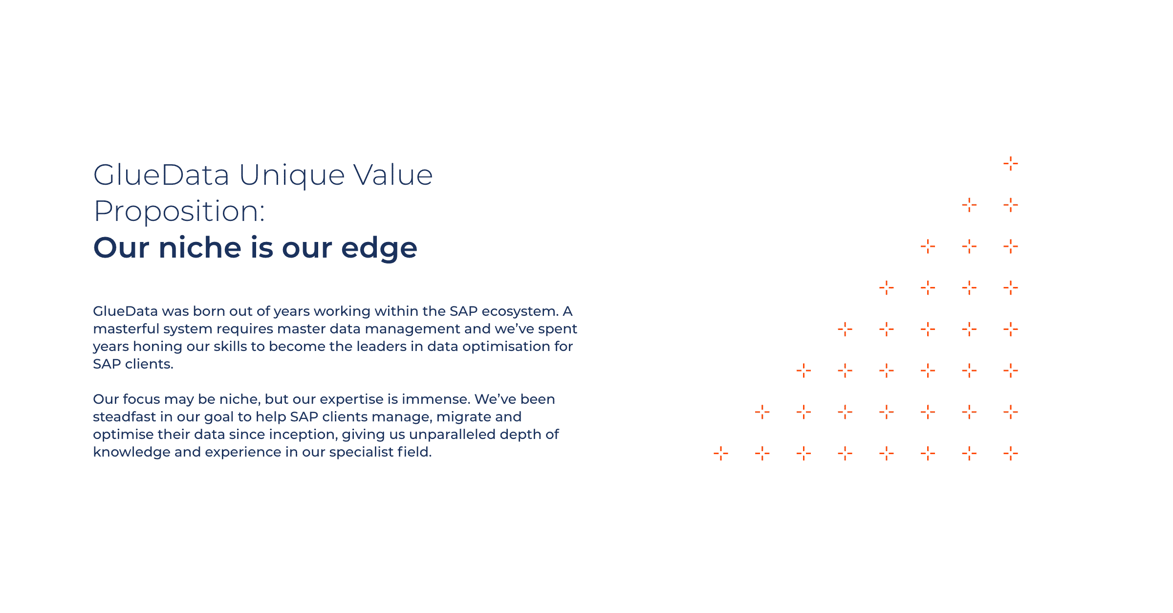
As part of the brand strategy process, I crafted a number of narratives to help the GlueData team share their story and unique value proposition with their key stakeholders. These stories focused on the business impact, rather than the technical detail, of their nuanced skills. Our design partner was inspired by the perceived convergence of passion and quality data instilled in the GlueData offering, and the resulting precision this affords their consultants and clients. This inspired the design of the reticle icon seen in the new GlueData logo, a symbol which is used as a patterning device and focus cue throughout the beautiful new brand collateral.


