The Brief
LM Attorneys (LM) was born from its founder, Lelethu Mbangi’s, desire to offer South African family-run businesses hyper-personalised and specialised legal, tax and commercial advice. Over the years, LM has distinguished themselves from SA’s major law firms (while matching their punching power), earning the implicit trust of esteemed private and family business leaders. But while the business itself has experienced significant success since inception, its remarkable story is known to very few. Branduo was tasked with unveiling Lelethu’s extraordinary background and vision through the development of a deeply personal verbal and visual brand identity.
Deliverables
- Brand strategy
- Client interviews
- Verbal identity development
- Website content creation
- Website information architecture
- Visual identity design
- Website design
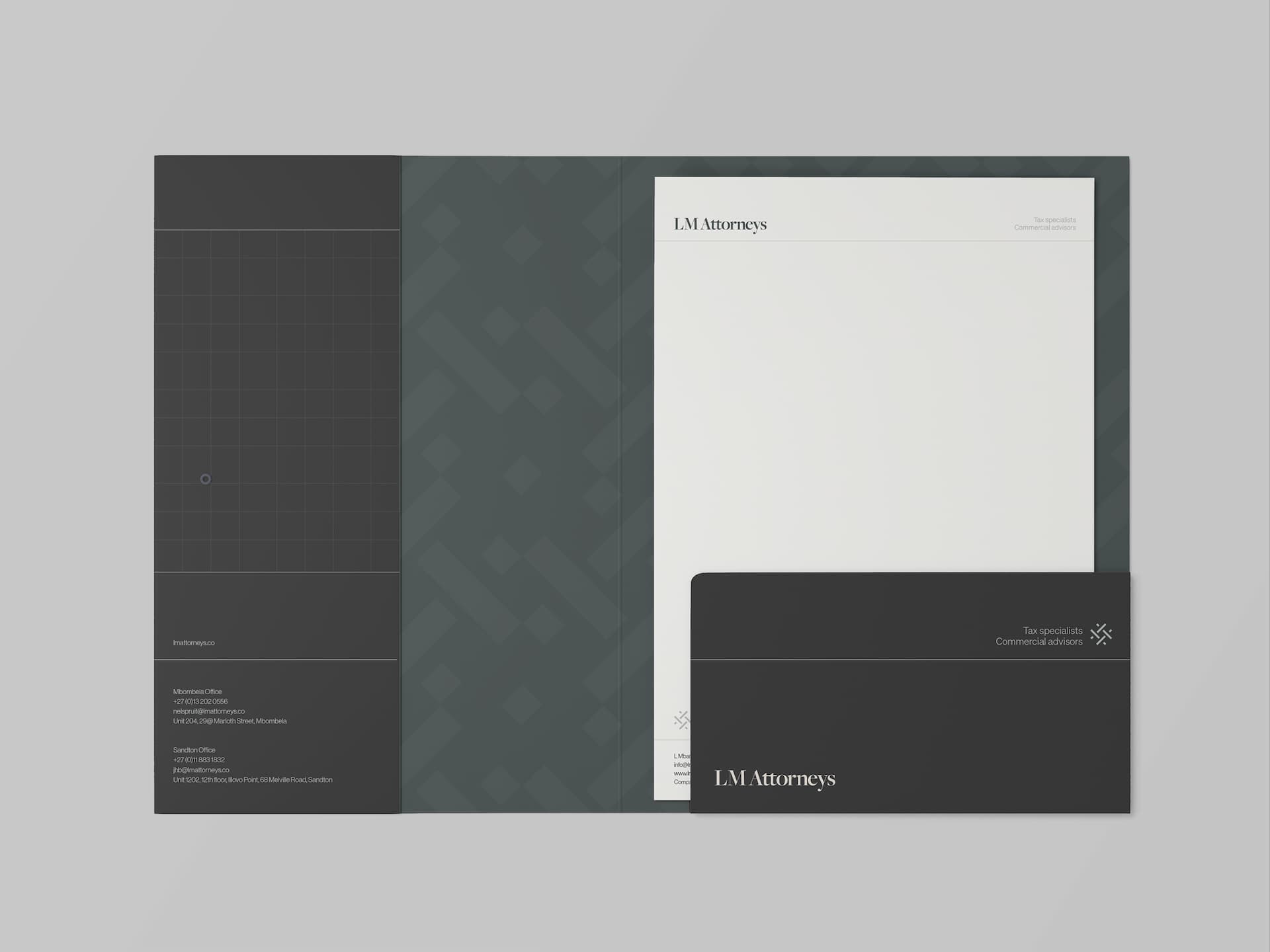
- Brand stationery and merchandise design
- Brand interiors design
Creative Partners
- Punch Design Co
- Digital Butter Marketing Agency
The Creative Challenge
Like many founder-led organisations, LM Attorneys focused on building its practice and client base and has done so successfully for twelve years. The brand, however, hasn’t received the same level of strategic consideration or care. As a result, the existing brand failed to capture the firm’s true essence, its truly unique value proposition and distinctive style; core facets of the brand experience which Branduo was tasked with bringing to the fore.

The Strategic Solution
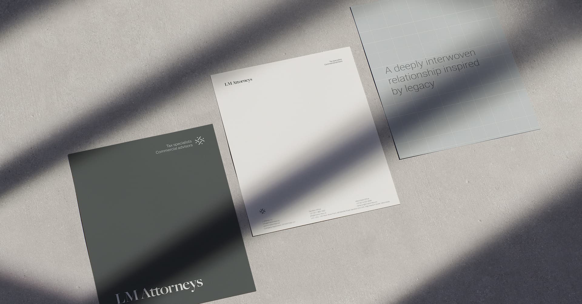
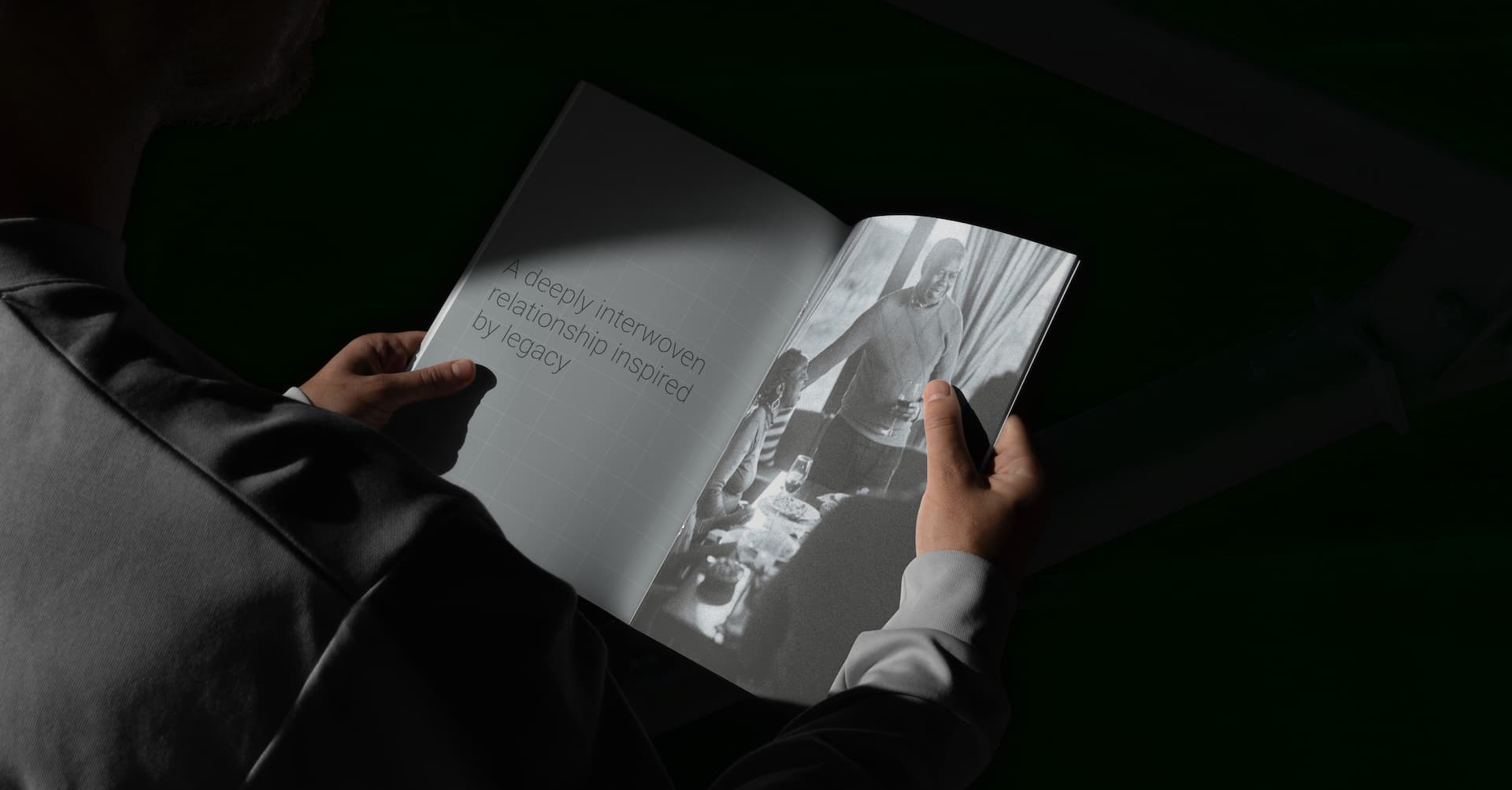
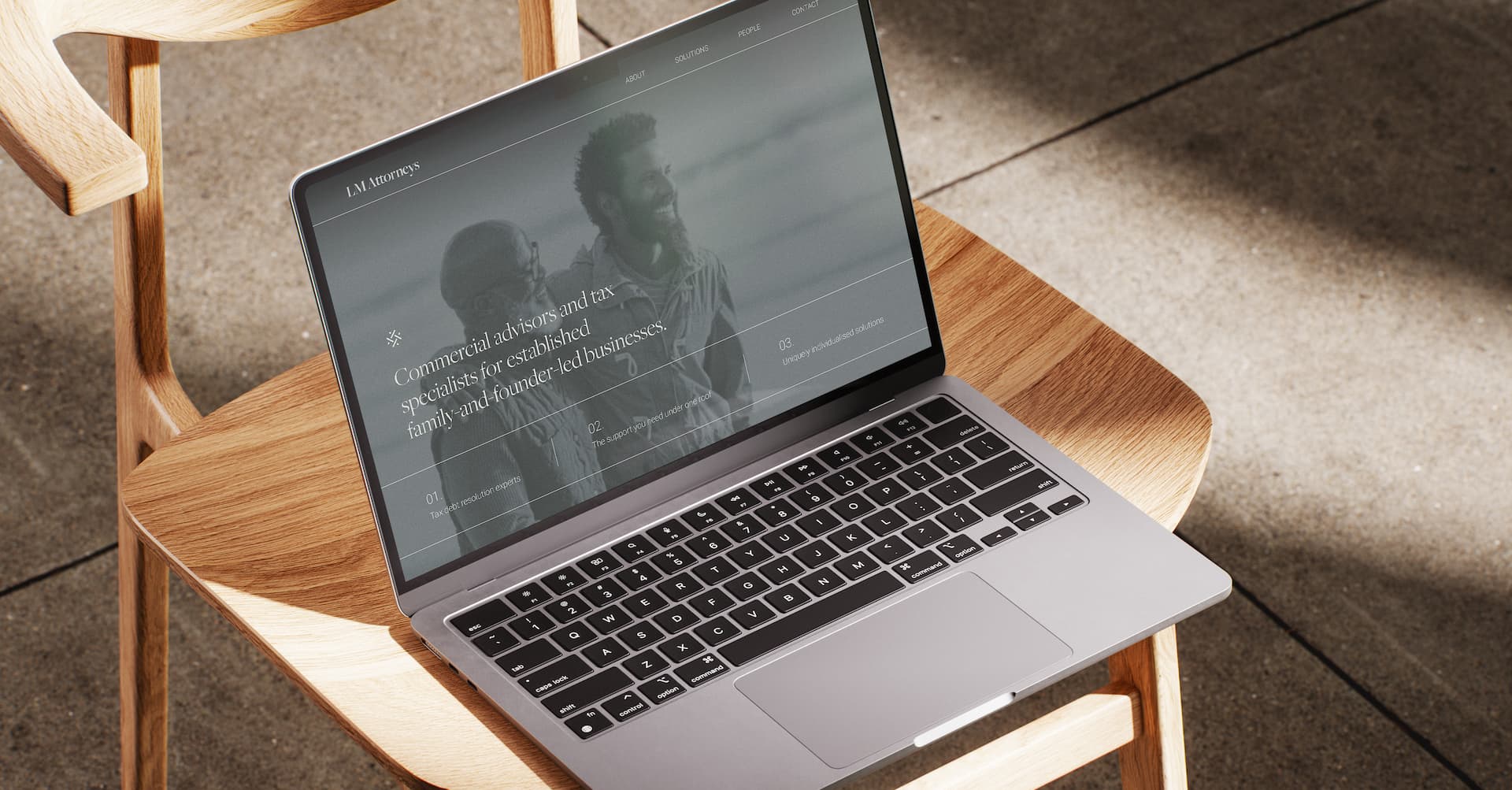
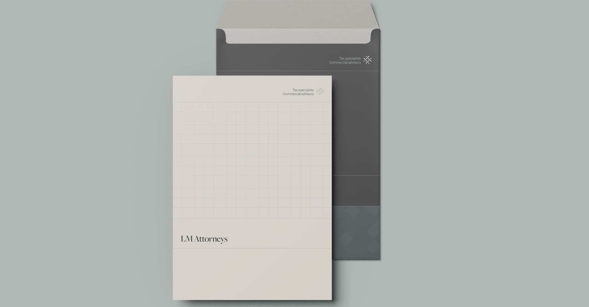
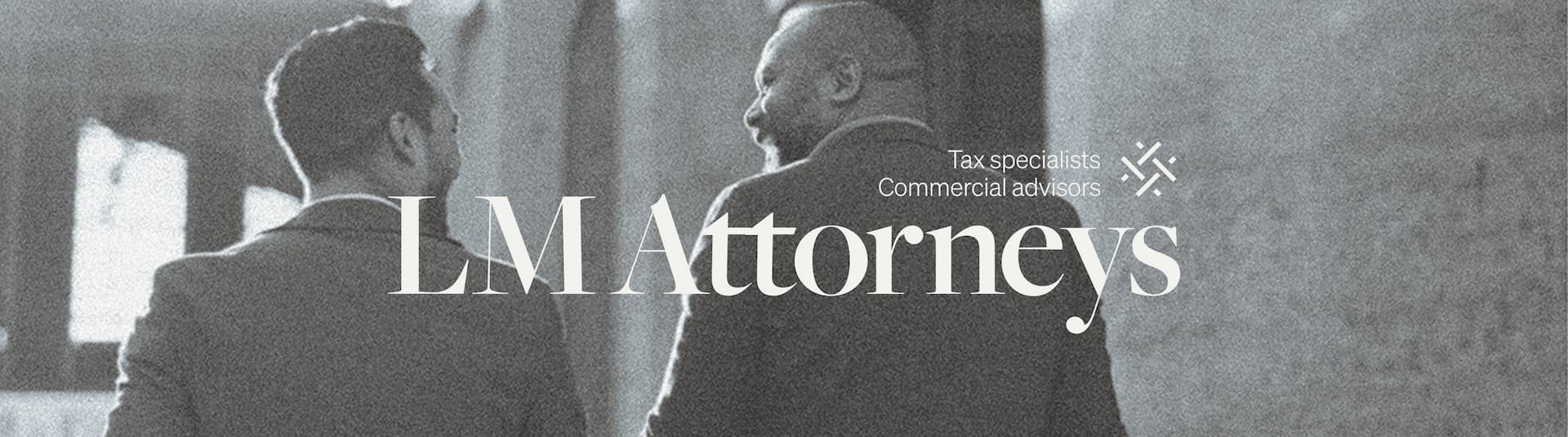
Lelethu was torn between positioning his business as a legal or advisory firm, given that its services spanned both realms. After carefully assessing LM’s competitors through the eyes of their clients, we retained the business name LM Attorneys but repositioned the firm from “great business lawyers” to “commercial advisors and tax specialists for established family-and-founder-led businesses.” This was the first step towards instilling the gravitas and clarity the brand sorely lacked. We then infused Lelethu’s story and ethos throughout the brand narrative; resulting in a deeply personal verbal identity that stands the firm apart in a sea of corporate sameness. Visually, the brand’s knot icon acts as a visual metaphor for the brand's interwoven, close relationships. Its family business roots are represented through real images of Lelethu’s family and their business, alongside monochrome, treated stock imagery that pays homage to the brand themes of heritage, legacy and generational wealth.