The Brief
Capricorn Capital SA’s expansion into the UK marked a significant growth milestone for the business, but it also brought the challenge of a name overlap with sister company, Capricorn Capital Partners UK. It quickly became clear that the similarity in names and identities was causing unnecessary confusion amongst their stakeholders.
With their 20-year track record, Capricorn’s foray into the UK presented a meaningful inflection point for the business. The need to rebrand wasn’t just about resolving confusion; it was a chance to define the business with greater precision, to honour its origins while signaling its ambitions and distinct value proposition.
Deliverables
- Brand strategy
- Client interviews
- Website content creation
- Website information architecture
- Visual identity design
- Website design
- Brand film project management
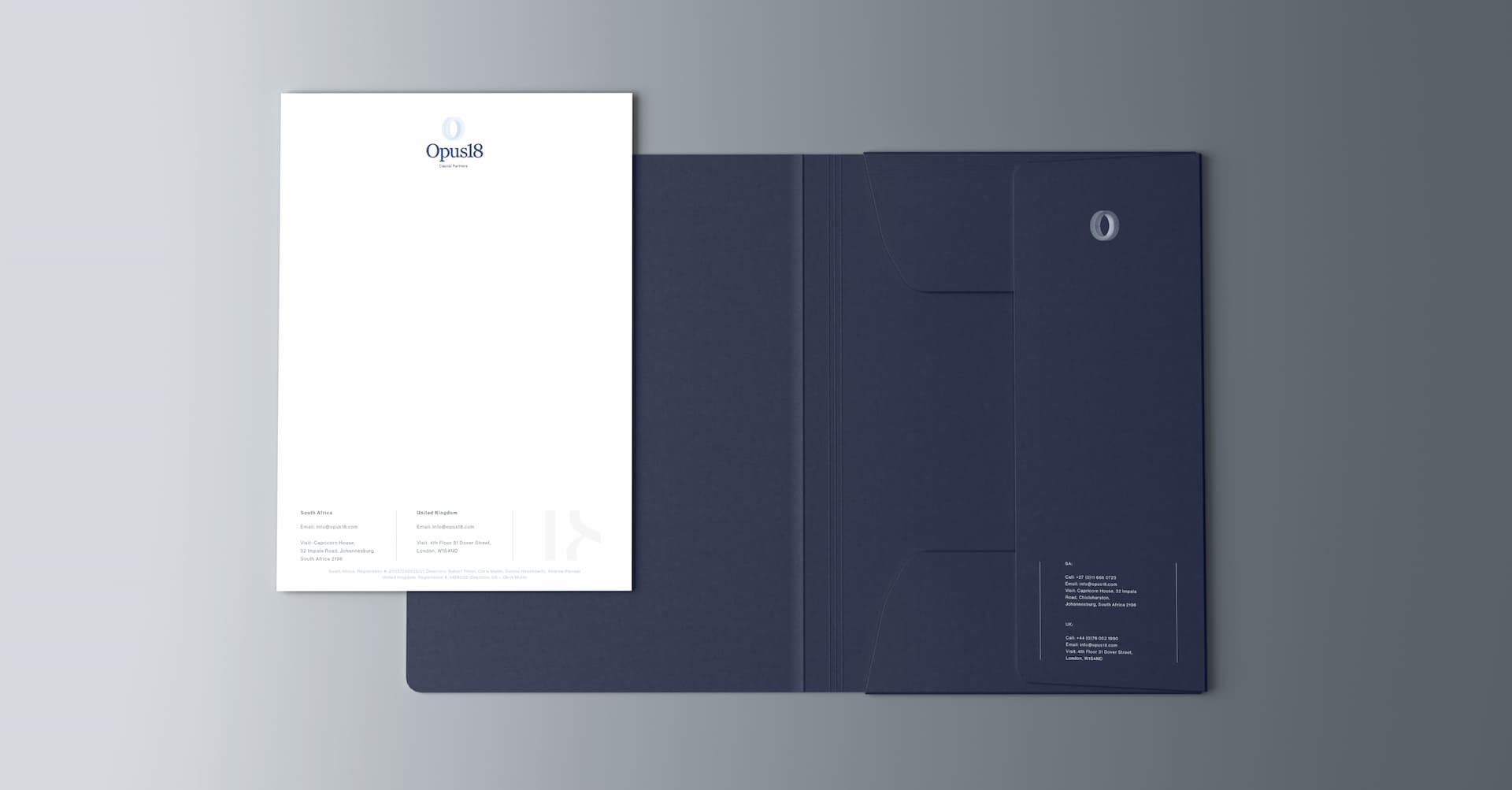
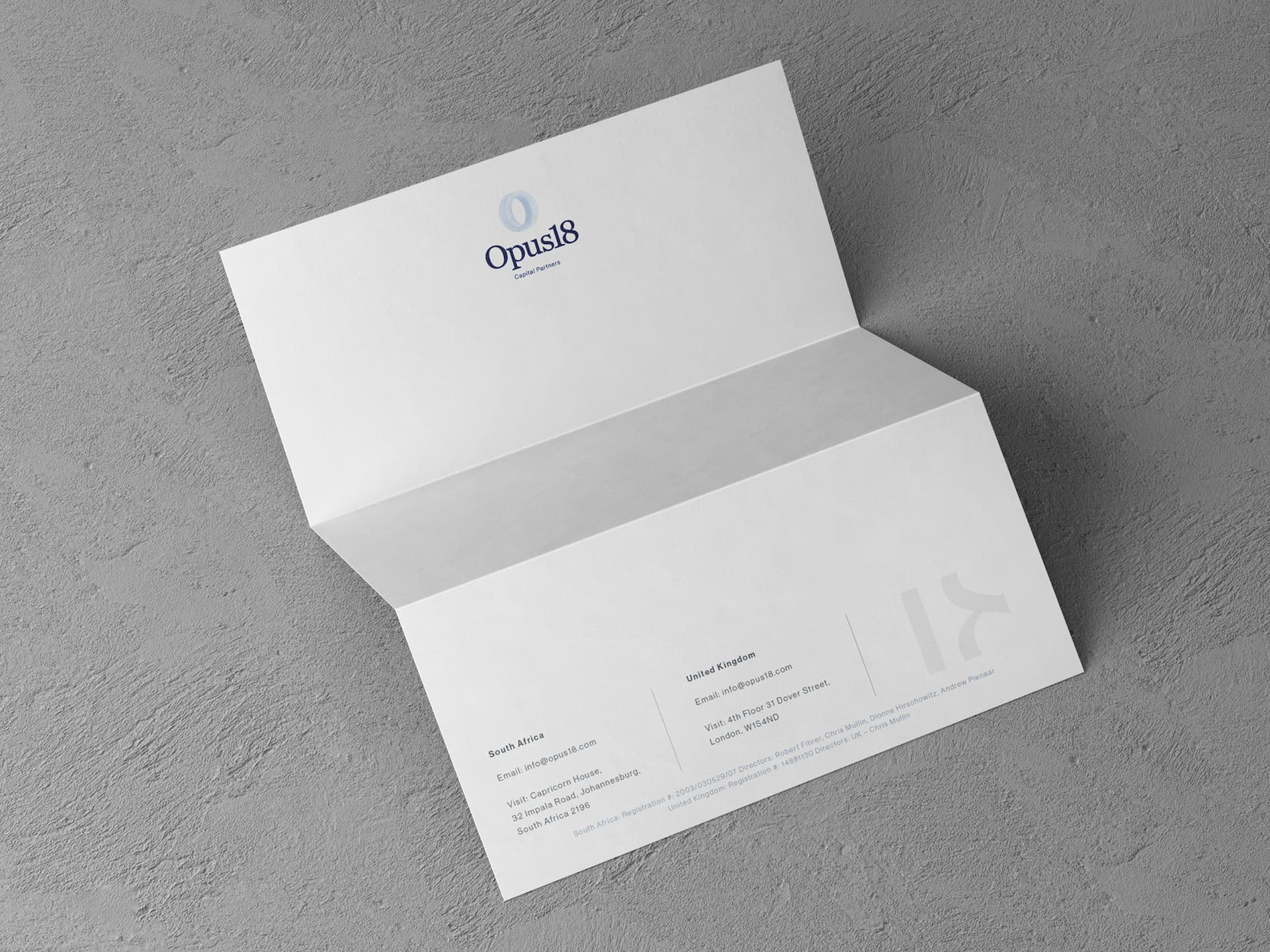
- Brand stationery design
Creative Partners
- Punch Design Co
- Digital Butter Marketing Agency
- Skyler Holic
The Creative Challenge
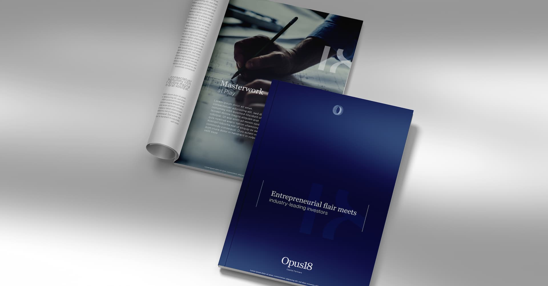
Rebranding a deeply established and venerated business calls for genuine respect for its origins, a nuanced understanding of stakeholder perceptions and lived brand experiences, and a clear appreciation of its evolved capabilities and long-term ambitions. Branduo assumed this responsibility, partnering with the Capricorn team to bring their new business name - Opus18 Capital Partners - to life, and to imbue the brand’s refreshed verbal and visual identity with the considered meaning this distinctive name carries.
The Strategic Solution
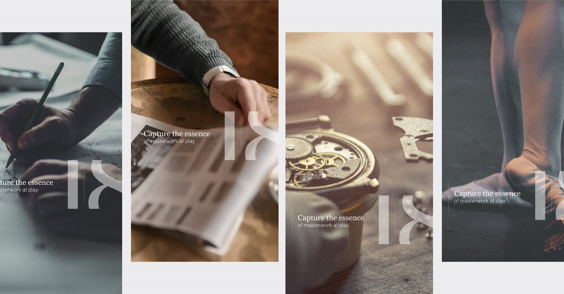
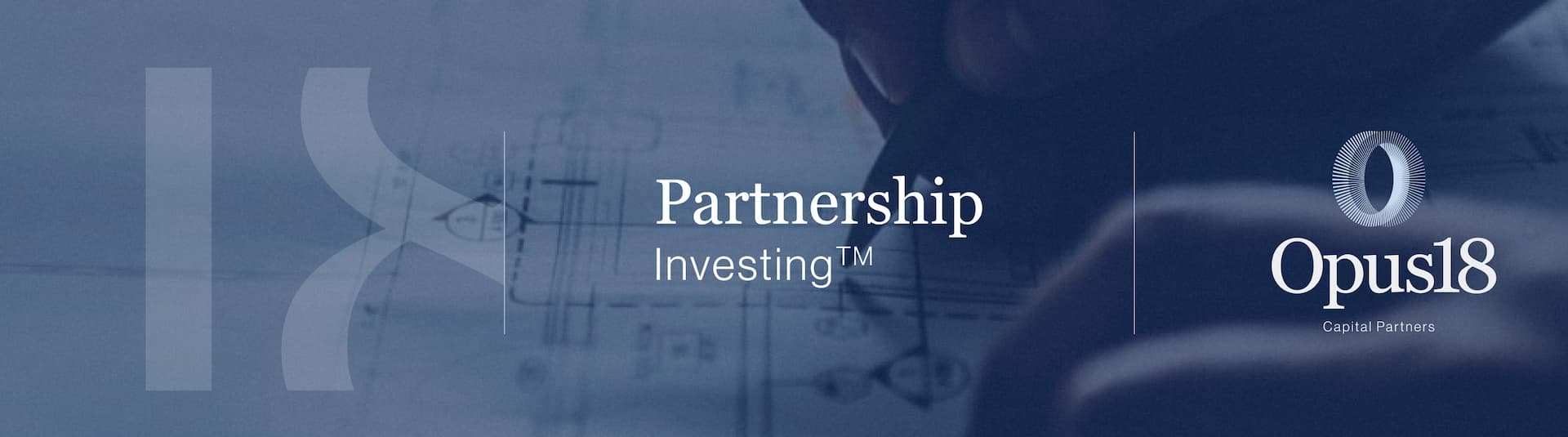
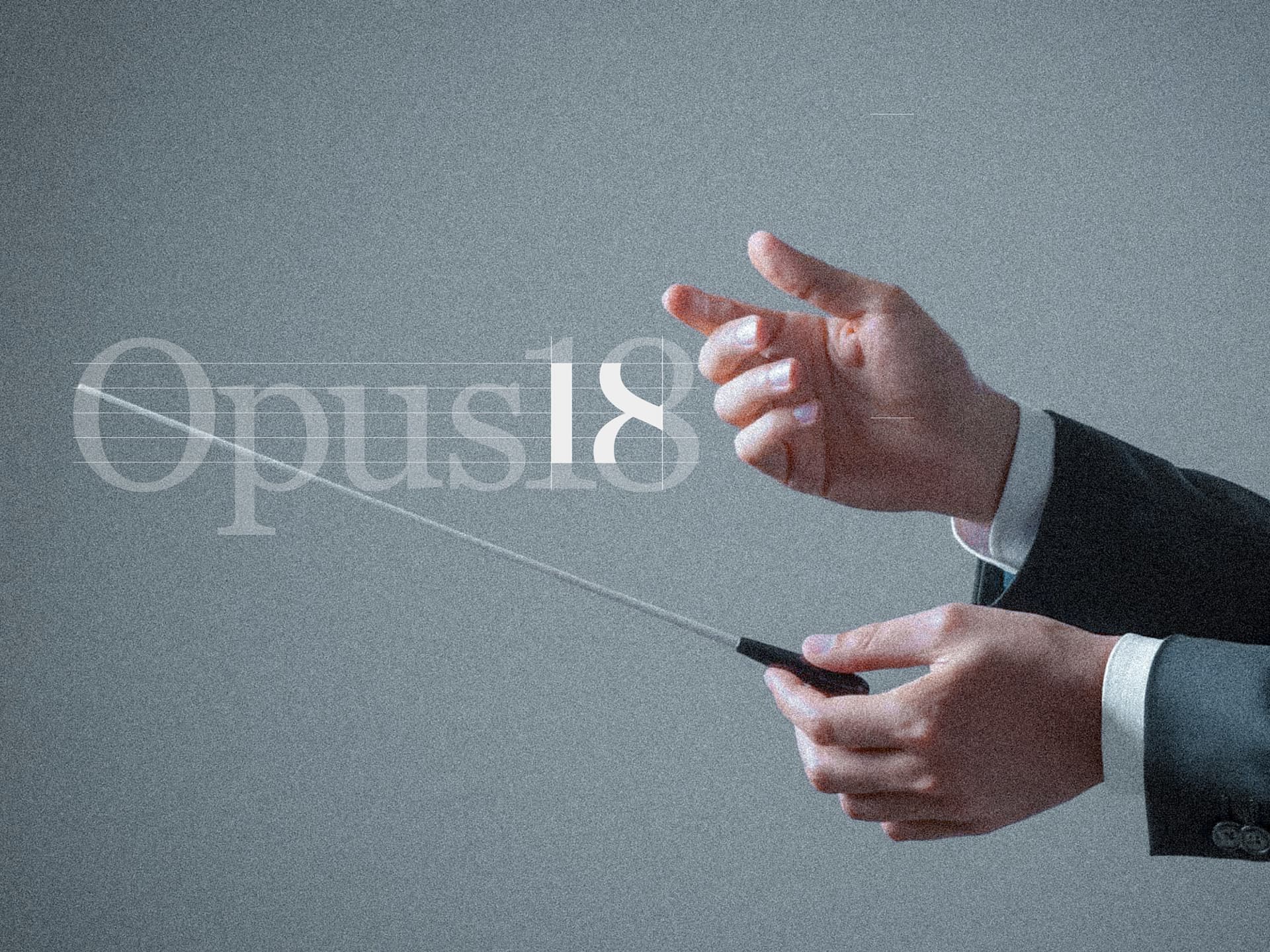
Opus18’s brand identity drew inspiration from its new name, richly infused with meaning: an opus is a masterwork, a legacy that stands the test of time. 18, a number deeply symbolic of life and prosperity, reflects the brand’s belief that investing is more than the quest for financial wealth, but rather the enduring pursuit of vitality, longevity and lasting impact. The brand’s tagline embodies its visual style - masterwork at play; that rare blend of true expertise, grit, intuition and relentless curiosity that makes one a true master of their chosen craft.
Their icon’s interlinked circles form an infinity symbol crafted from musical staves that honour the brand name’s orchestral roots and symbolising their relentless pursuit of enduring prosperity.