The Brief
SA Business School was launched as an education and training partner to corporate South Africa in 2015. The organisation has trained thousands of learners since inception, but its founder believed the brand would benefit from a strategic repositioning and identity update in order to differentiate itself within a heavily saturated market.
Deliverables
- Brand Strategy
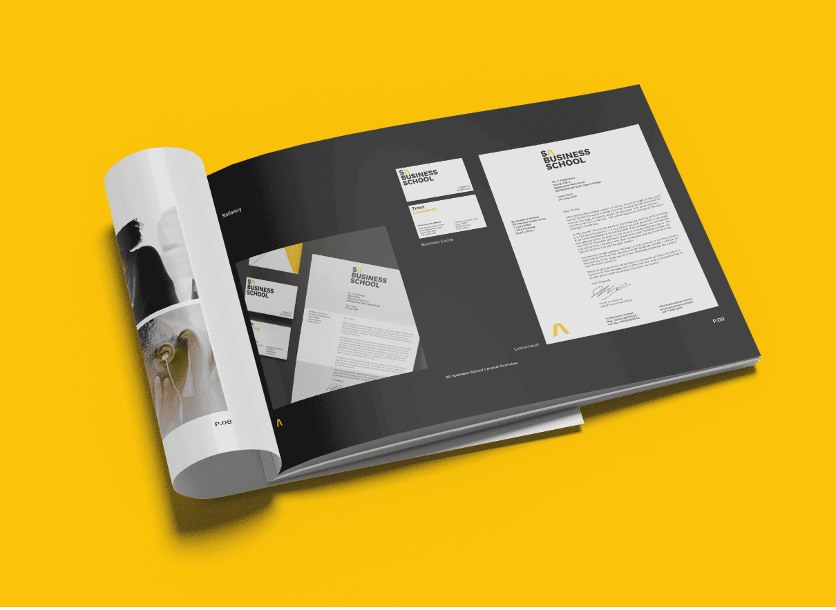
- Brand Identity Design
- Copywriting
- PowerPoint Design
Creative Partners
- Si Maclennan
The Creative Challenge
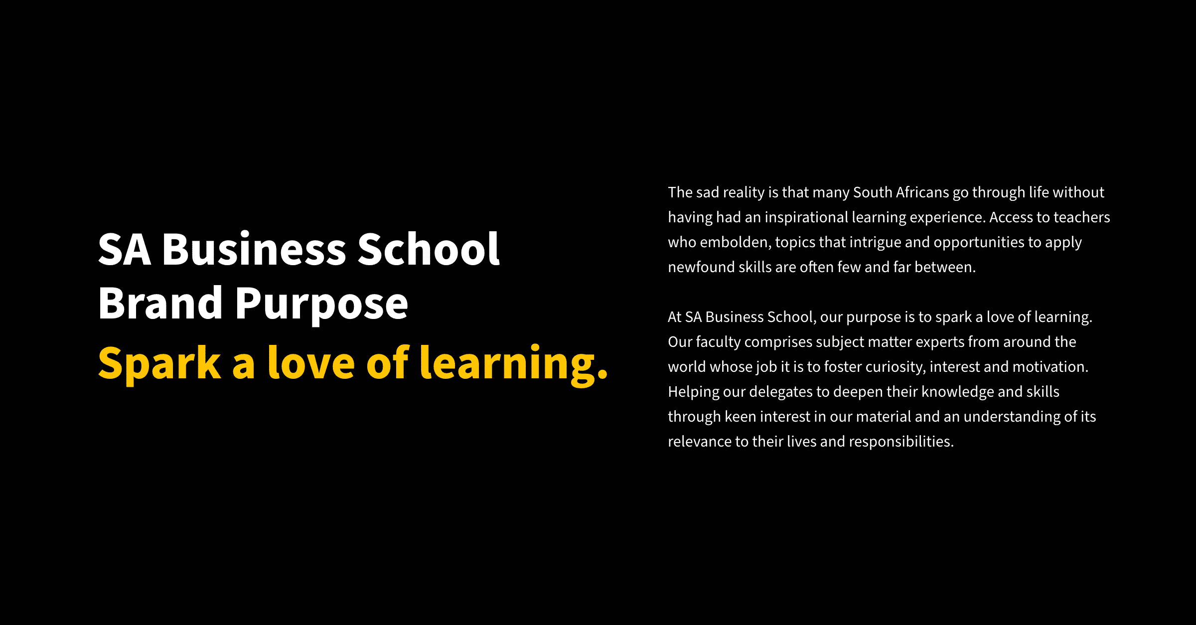
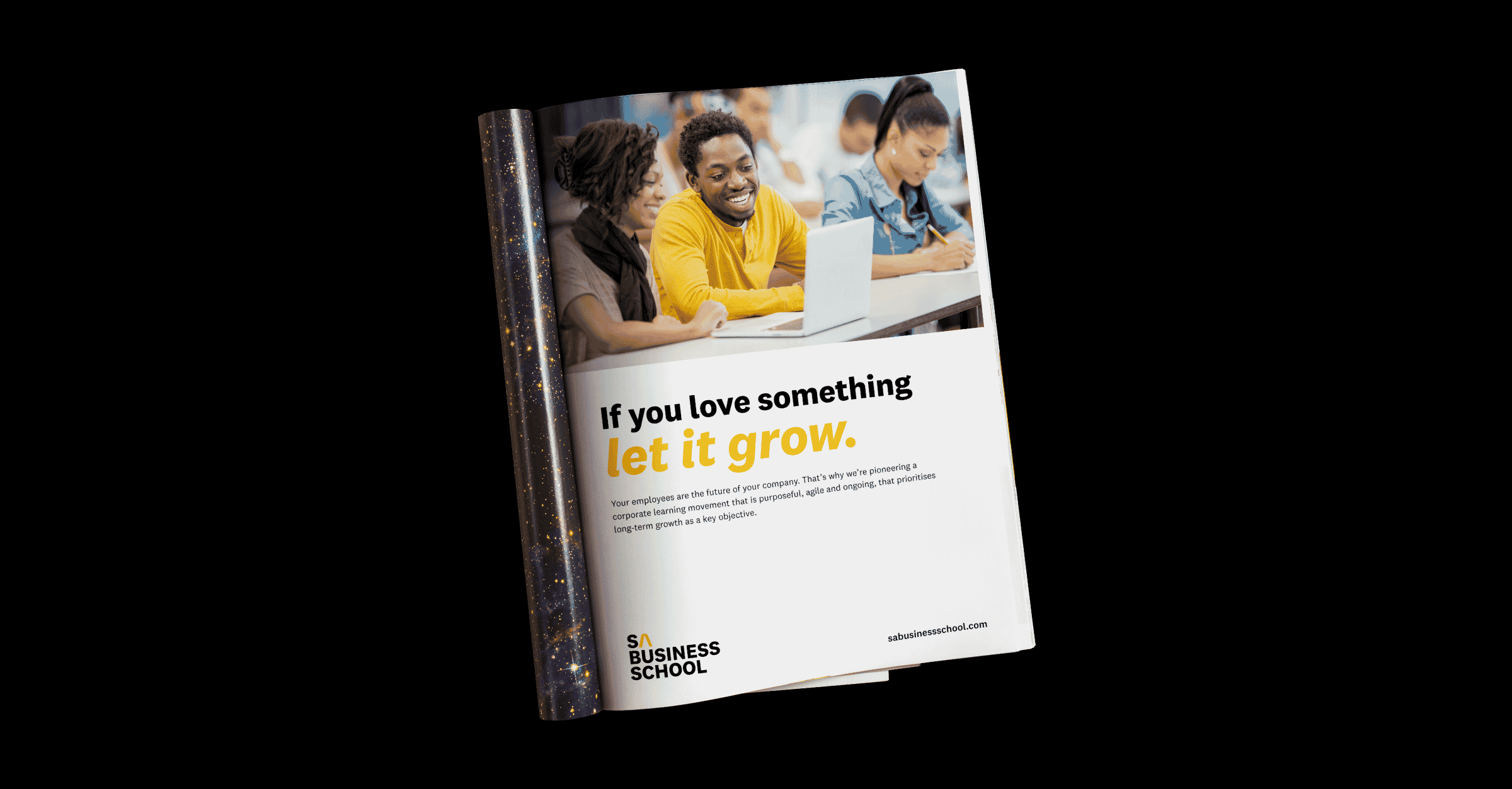
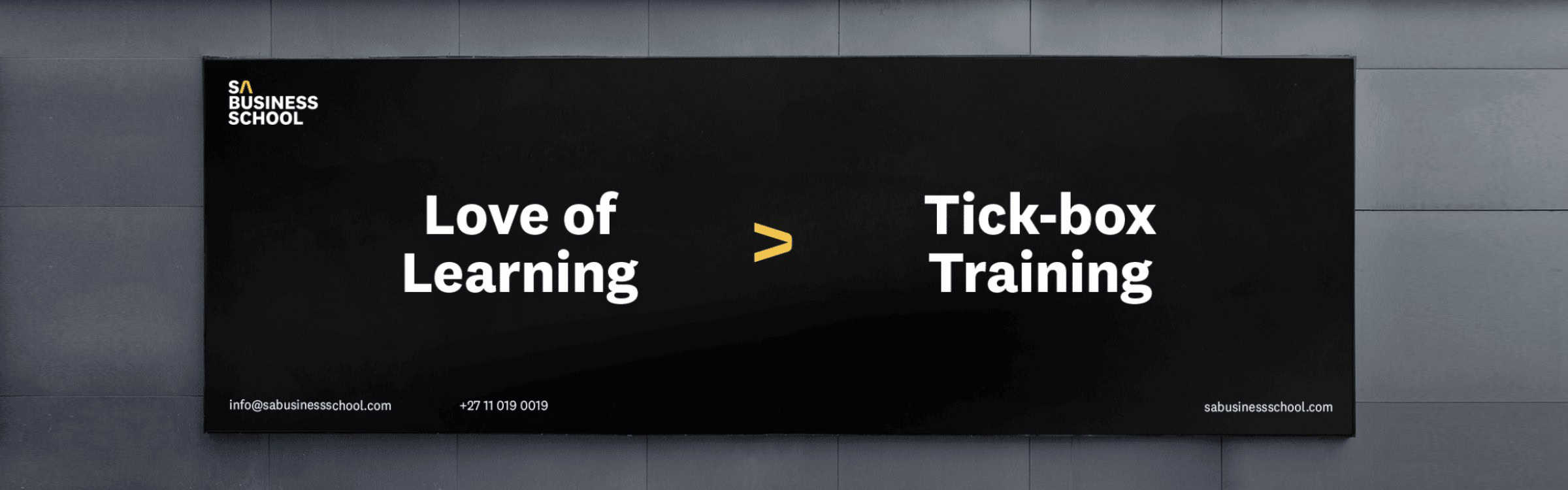
SA Business School competes with many other learnership providers who regard their offering as a “tick-box exercise” – a perception shared by many corporate clients. Our brand strategy workshop unpacked how the client had turned the learnership offering on its head, pioneering a corporate learning movement that is purposeful, agile and ongoing. The resulting brand expression needed to reflect this, underpinned by the visual embodiment of the brand’s newfound purpose – to spark a love of learning.
The Strategic Solution
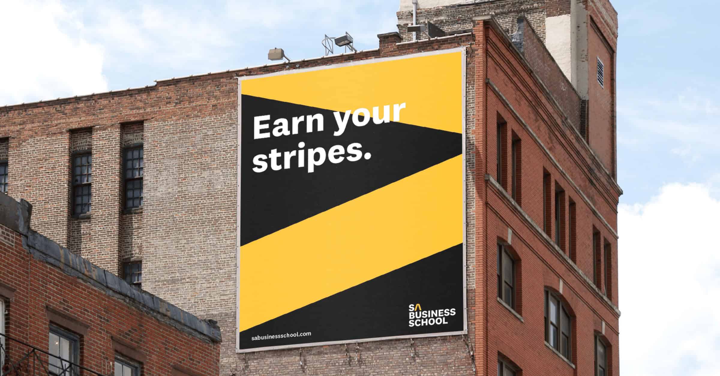
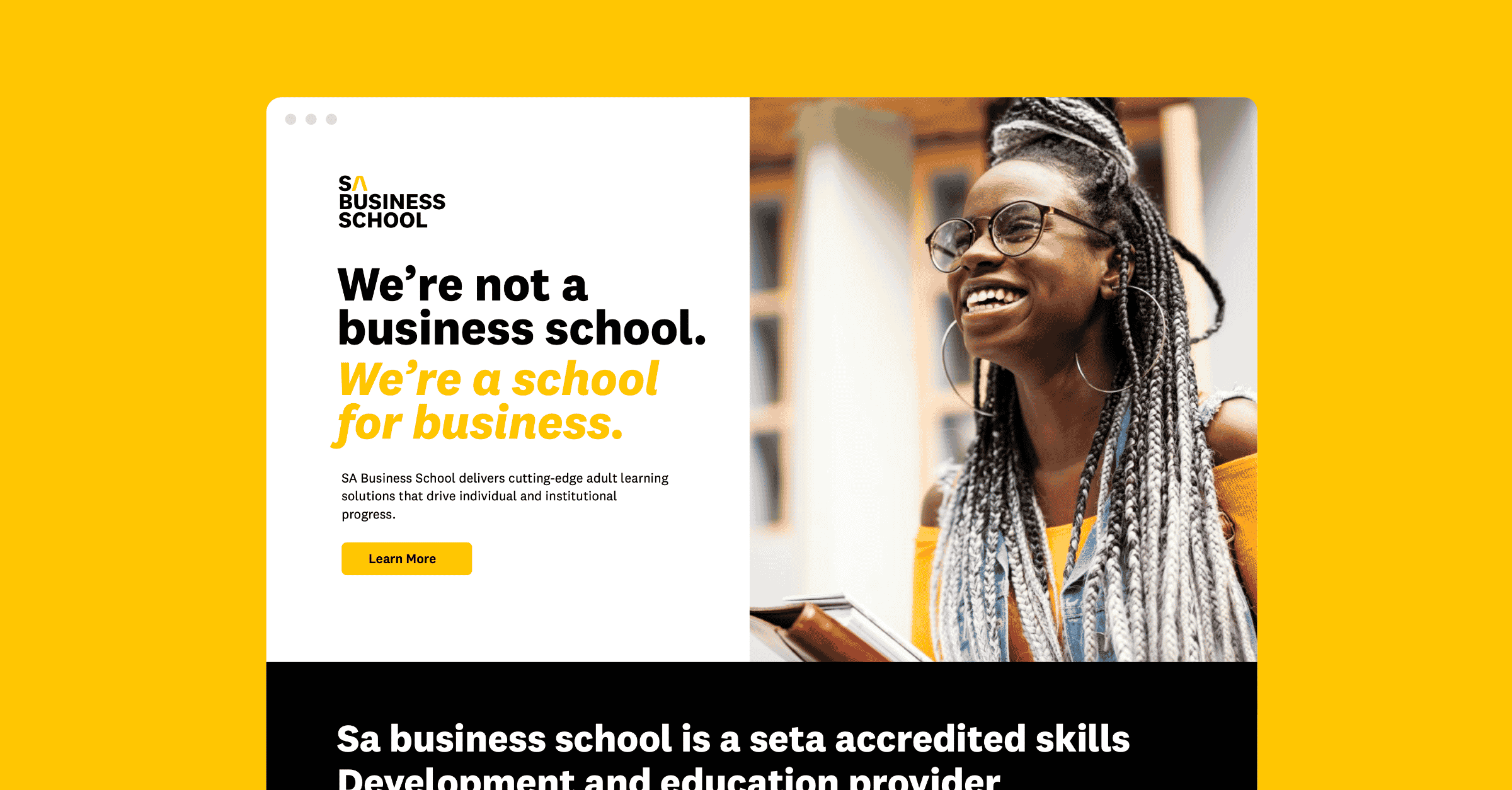
We equipped the brand with a sassy brand personality that is gutsy, astute, dynamic and human. This inspired a tone-of-voice evident in the brand narratives developed, which greatly informed the new visual style. The old identity was completely overhauled and transitioned from a traditional South African learning institution aesthetic into a bold, modern and dynamic visual identity. The brand promise of “enlighten and advance” is evident in the golden yellow primary colour and the hand-crafted arrow used as the “A” in the wordmark and as a clever device for primary headings and landing banners.