THE CEDARS
Project Overview
Key Deliverables
+ Brand Strategy
+ Brand Identity Design
+ Copywriting
+ Marketing Collateral Design
+ Website Design
Creative Partners
+ Room 13 Design Agency
+ DMN Creative
The Creative Challenge
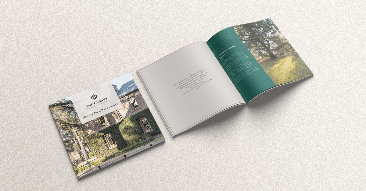
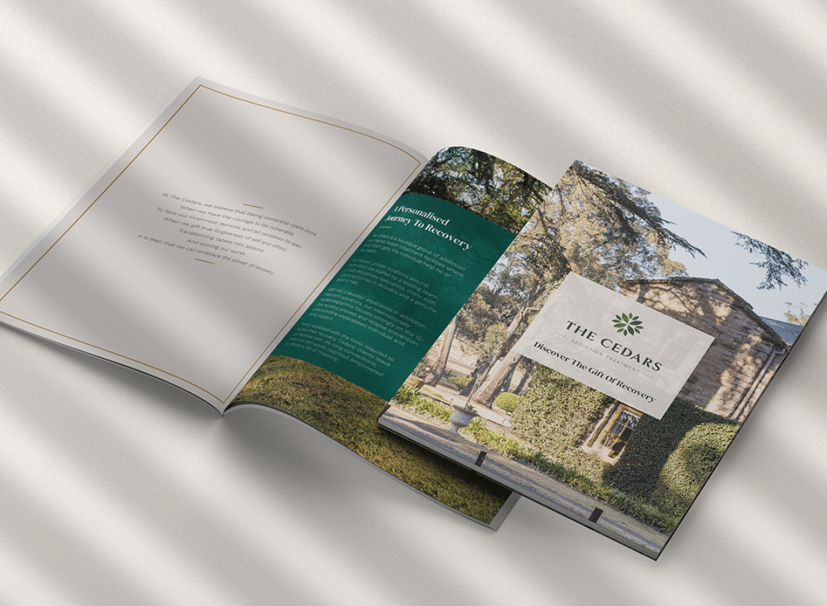
A new facility acquired needed to be absorbed into The Cedars group. This required an extensive brand architecture exercise which considered the design and naming requirements of the parent brand, the current addiction facilities, and future verticals of interest. The new brand and primary sales platform – the website – needed to instil a sense of trust and capability in prospective clients and their loved ones. We aspired to achieve this through the marriage of real imagery, empathic yet professional language and sufficient technical information to answer upfront concerns and provide insight into The Cedars’ unique approach to recovery.
The Strategic Solution
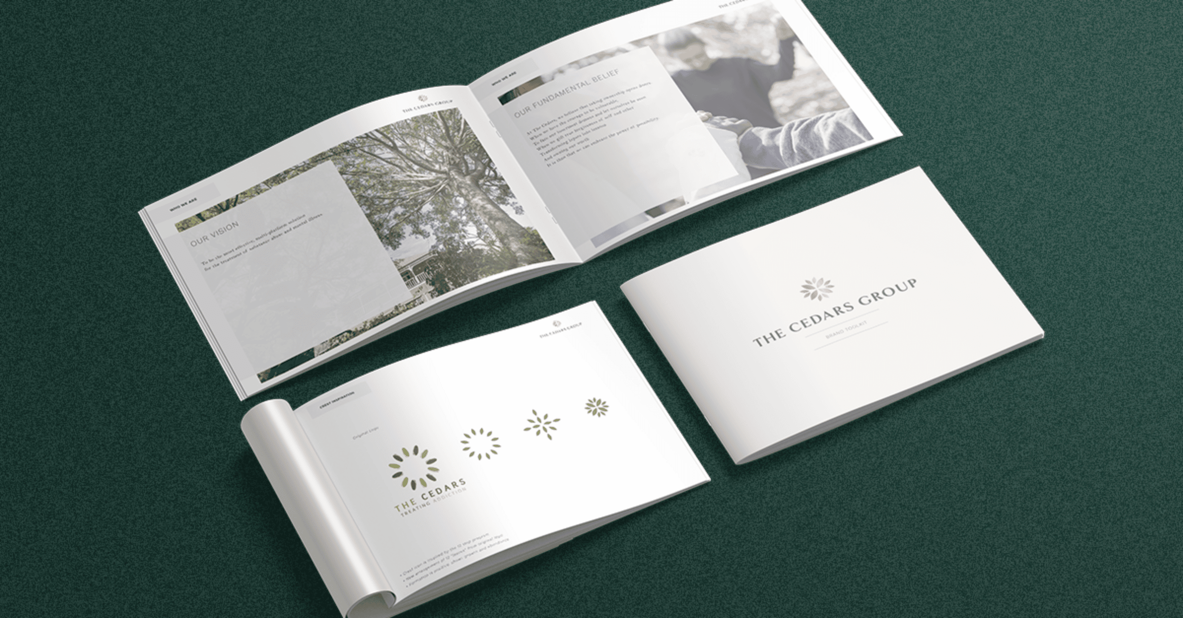
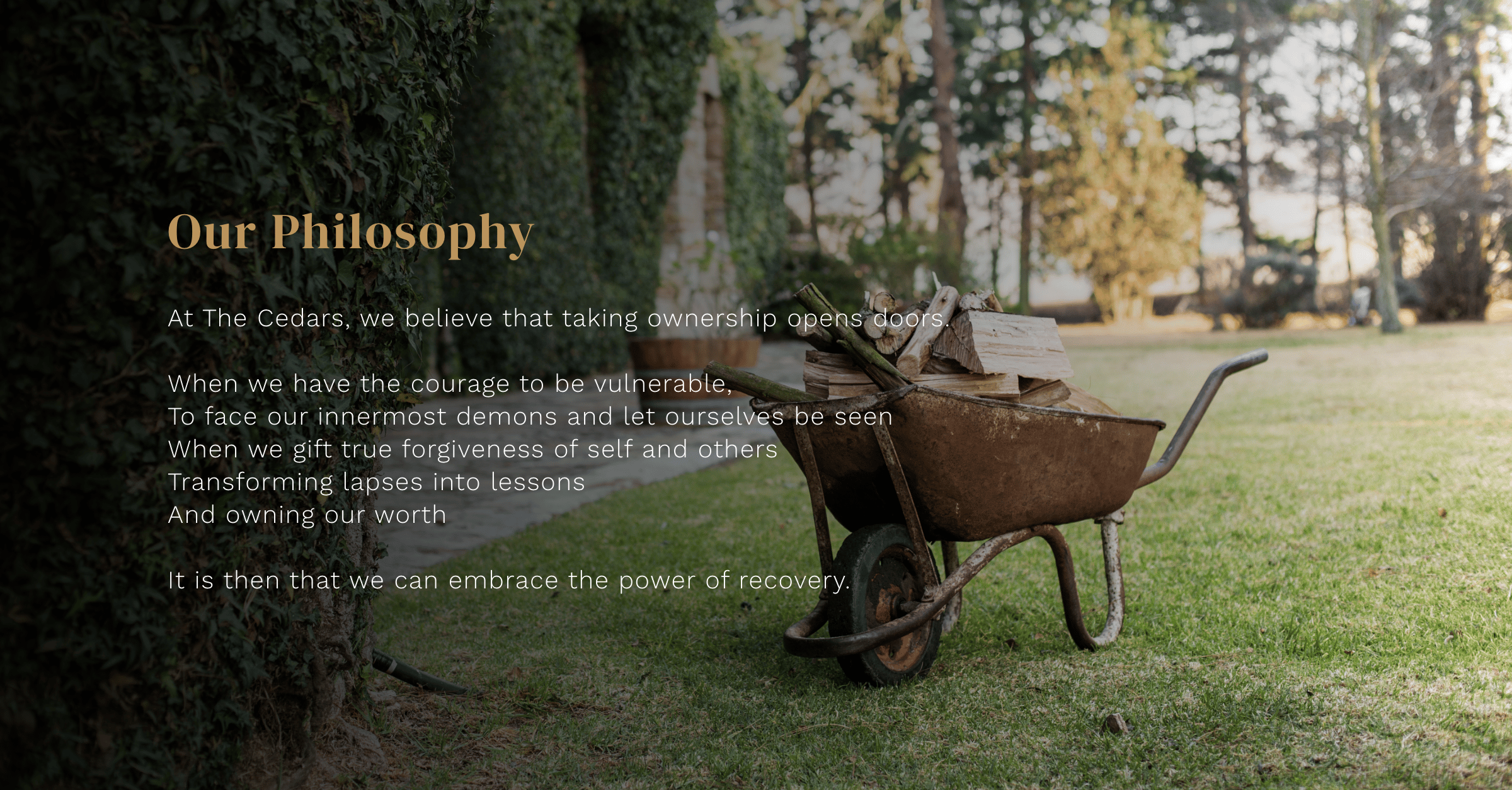
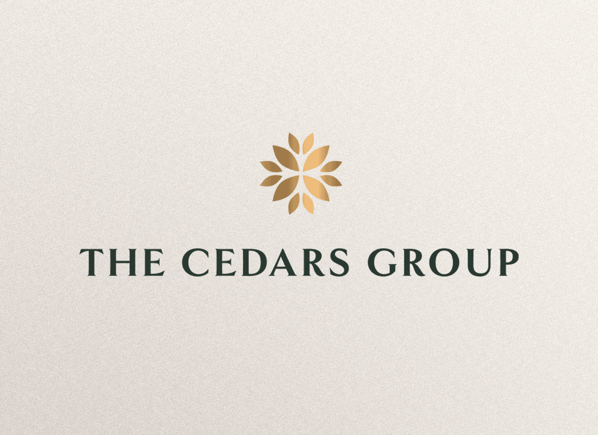
The new Cedars logo was designed as an evolution of the original which featured 12 leaves, inspired by the 12 Step programme. The new formation has a modern and uplifting feel and is designed to represent the outcomes of growth and abundance instilled in the Cedars’ programme. The brand architecture process resulted in a monolithic brand structure that honours the new parent brand, differentiating the various business pillars through a gentle and fresh colour palette of green, gold, cream and sky-blue shades. Custom photography was captured of all 3 treatment centres to imbue the new website and collateral with authenticity and an overarching sense of the tranquility and superior calibre of these life-changing facilities.