The Brief
Striata, a global customer communications management company, was acquired by Doxim in September 2020. Branduo was tasked with the rebranding of Striata’s South African business into Tilte Customer Engagement: an independent brand and revitalised offering for the African continent.
Deliverables
- Brand Strategy
- Customer Interviews
- Corporate Identity Design
Creative Partners
- Tim Harris Design
- Irvine Partners
The Creative Challenge
How does one relaunch an existing brand to an existing audience with a new name, offering and aesthetic? By understanding the needs of that audience and shaping the product, verbal and visual identity to clearly meet those needs. Branduo hosted in-depth interviews with a number of Tilte’s clients, applying the core insights into a revitalised brand expression that is both fresh and familiar.


The Strategic Solution
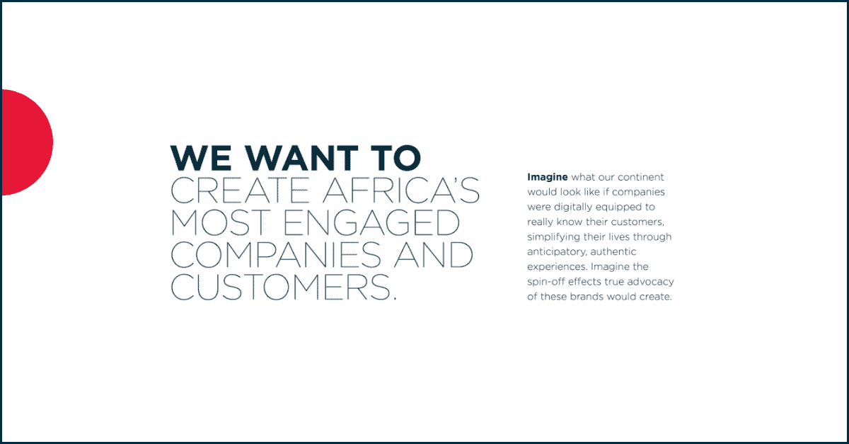
Customer engagement is one of the greatest corporate responsibilities you can have. And so often those placed in this role are left with reams of data, but no roadmap for how to turn that data into an enhanced customer experience. This led to Tilte’s newfound positioning of turning disengaged customers into brand advocates and brand promise of making life easier for our clients, and their customers. Our design partner recognised that simplicity is a hallmark of Tilte’s communication. He created a timeless and iconic logo that appears simple in static form but is brought to life in its primary animated expression. The tilted “i” is a visual reference to the shift catalysed by the brand and its cherry red dot is enlarged across select brand collateral to create a unique design element.