The Brief
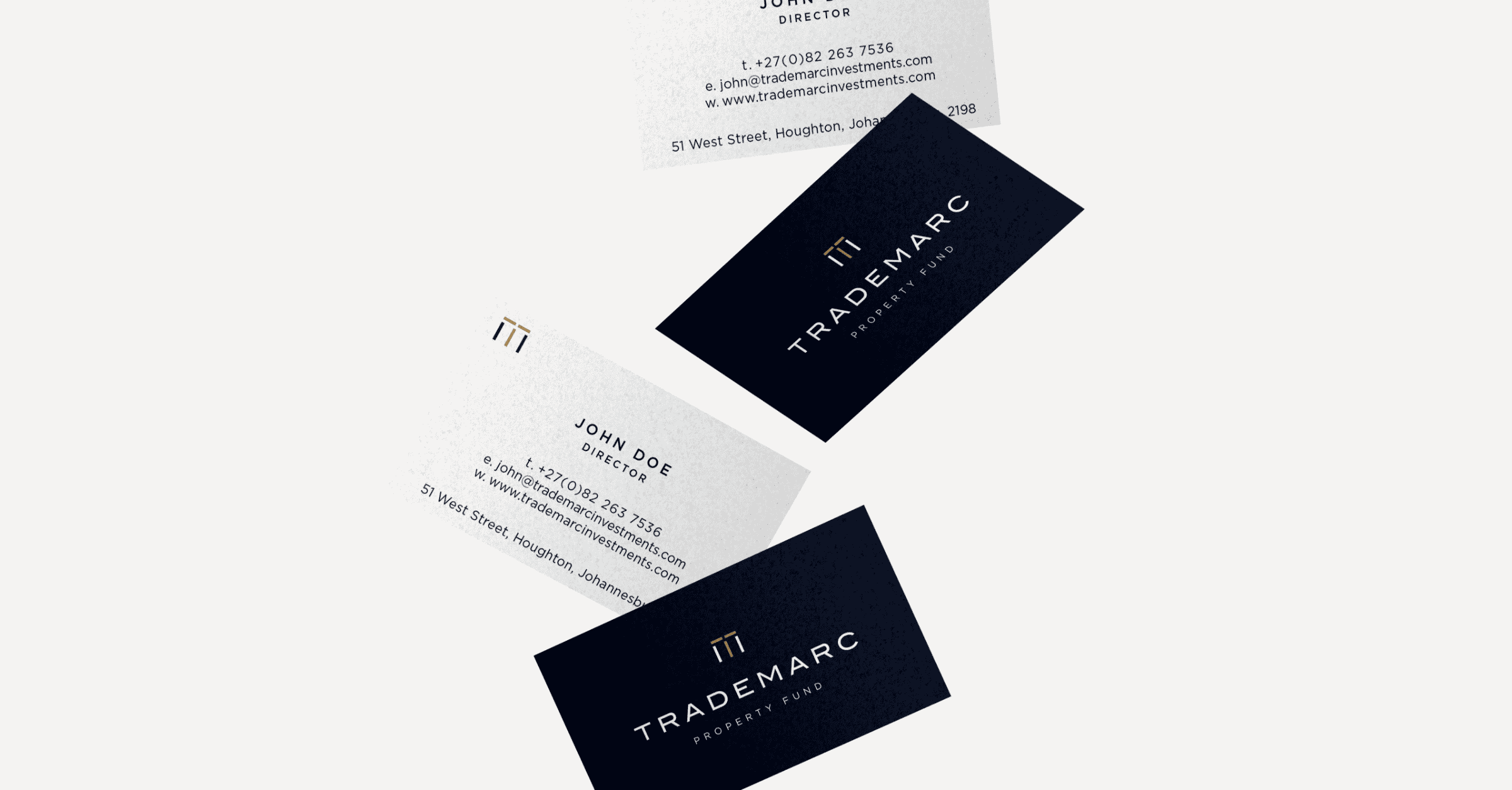
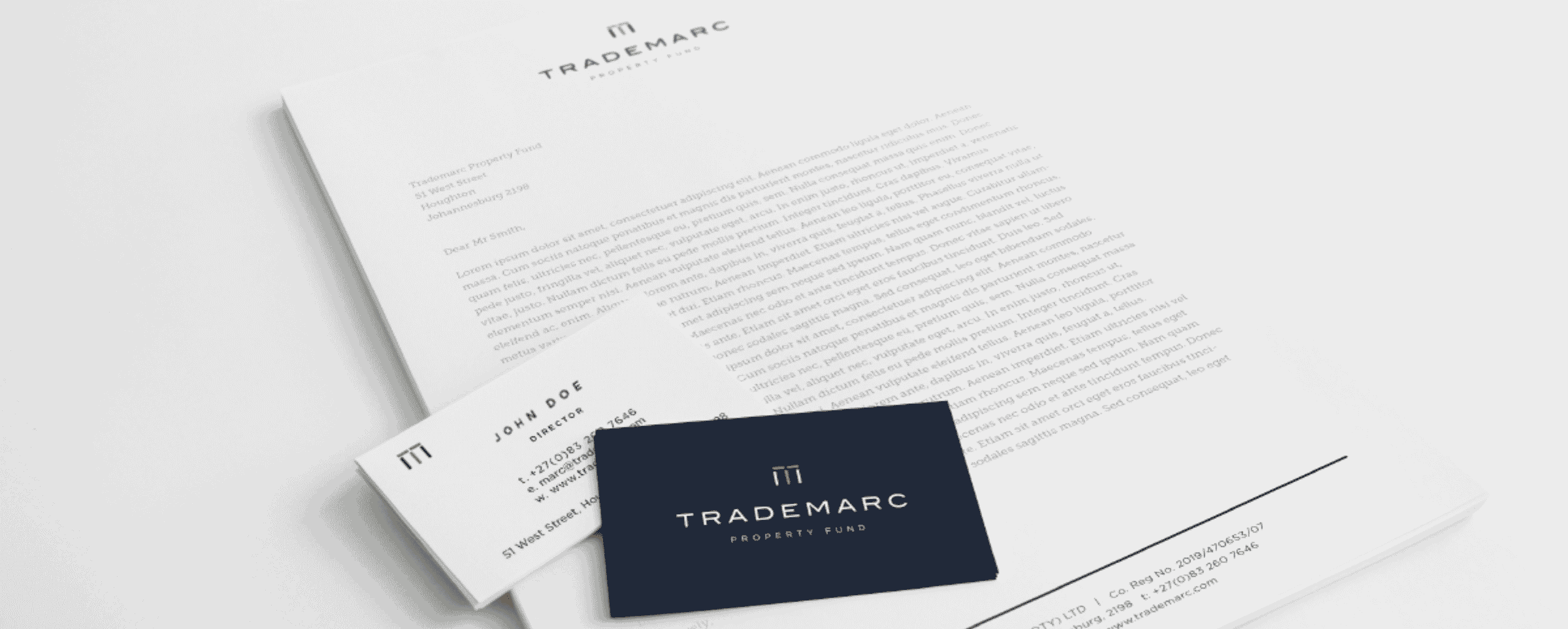
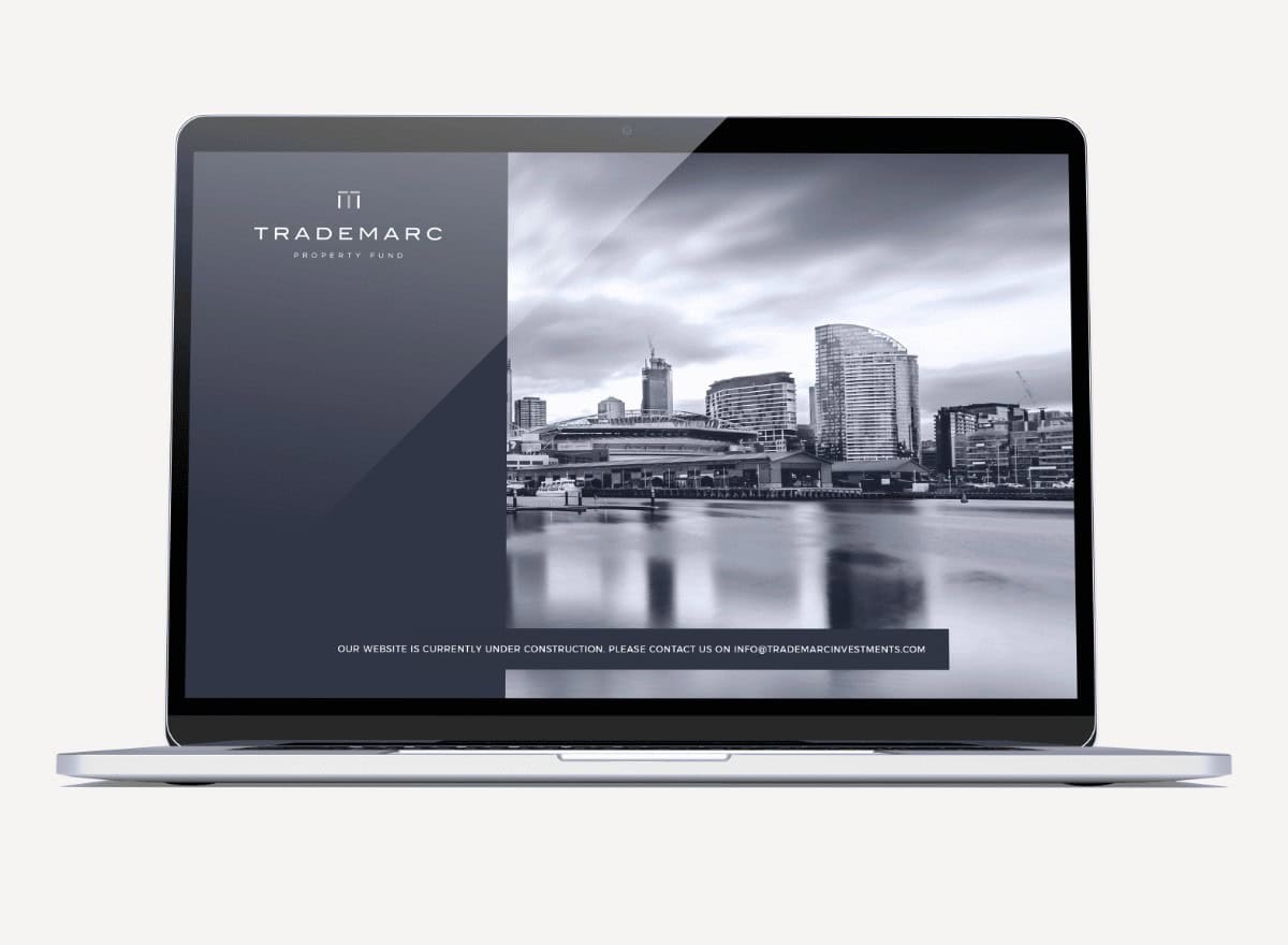
Trademarc is a private property fund that focuses on trading opportunities in Europe, particularly Eastern Europe. Branduo was tasked with the design of a logo, brand identity and stationery that would resonate with both local and global partners.
Deliverables
- Visual Identity Design
- Marketing Collateral Design
- Website Landing Page Design
Creative Partners
- Room 13 Design Agency
The Creative Challenge
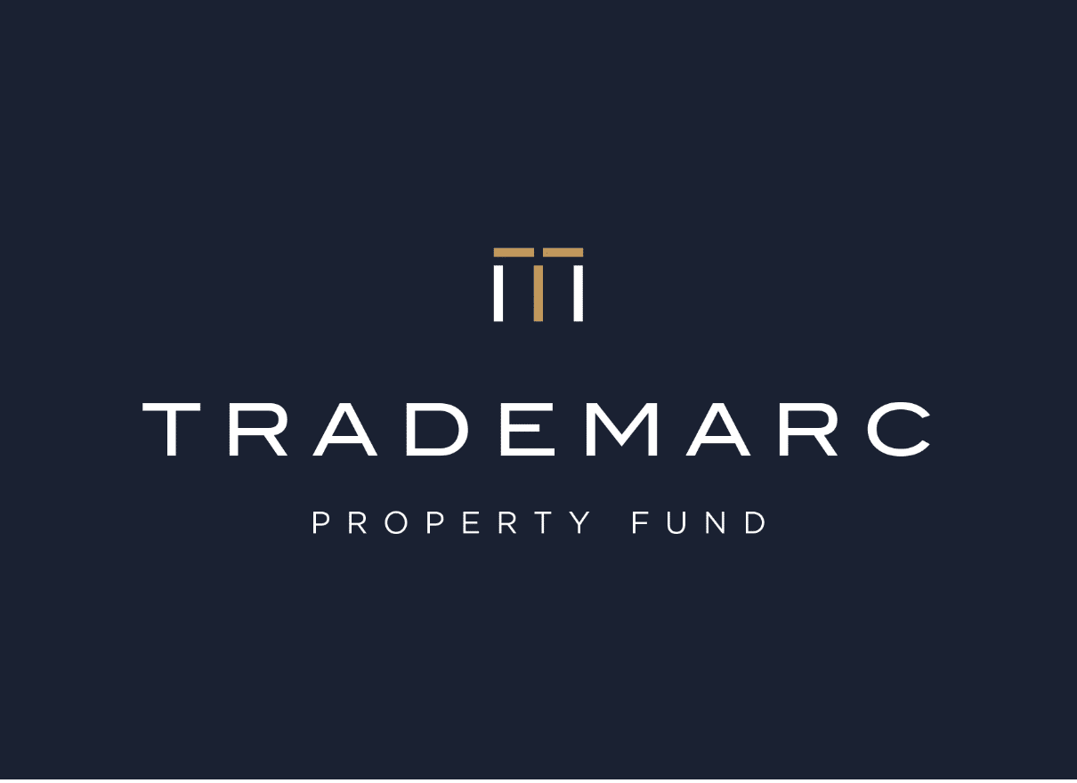
The Trademarc brand needed a strong yet minimalist brand identity with a brand icon that could be used as a standalone visual asset. The supporting colour palette and typography needed to lend the brand an edge while, retaining an overarching feel of professionalism and expertise.
The Strategic Solution
The resulting brand mark cleverly combines the T and M of the company’s name while the primary colour palette of gold, navy and soft grey give the brand a sophisticated edge that is bold yet restrained. The selected photographic style treats black and white imagery with a soft blue lens that lends warmth to the brand’s visual language.